Six Months of Live TV: More Sports, More Recommendations, and a New Guide (oh my)
October 11, 2017
By: Ben Smith, Head of Experience at Hulu
When we launched our live TV service back in May, our goal was to bring you all your TV in one place and make sure you never miss a moment of your favorites— whether that was this morning’s news, the big game, last night’s TV, that movie you love or Game of Thrones. The challenge was figuring out how we marry live and on-demand TV together into one simple, seamless user interface (so you don’t have to go back and forth through apps to find your shows), and that required a new look and feel.
With the new Hulu experience, we’ve built a personalized experience that gets you to the live or on-demand TV and movies you want quickly. And we’re super proud of what we’ve built. On average, viewers are spending 5 percent more time with Hulu and consuming a greater number of newly discovered TV series and movies.
But we’ve learned a ton over the last six months too, especially by listening very closely to our viewers and community on social, in forums and through the feedback you’ve given through our Viewer Experience Advocates. And we agree there are a number of enhancements that we can make to improve the viewing experience even more. Some of these we’ve added already, like new episode badging and the ability to see more options when browsing, and others are coming very soon.
One of our key learnings from our Live TV viewers is that our live content feels, at times, hidden or harder to get to than you would like. So we set out to make some changes. The first step was introducing a live TV-only web experience in August to both enable viewing of Live TV on computers and laptops and to test a live-TV forward UI. Since launching beta.hulu.com, we learned that viewers watch *a lot* of live sports on the web and the ease of finding all of the live sports on at a time was a great experience.
The second step was changing how we surface and recommend content in the Hulu UI. We’ve been creating curated one-stop destinations for College Football and The NFL games, automatically recommending games with teams you’ve added to My Stuff. And we are more frequently recommending live news and live sports to viewers if you’ve expressed interest in that programming. The result? Viewing of live content has increased by 70 percent since the beginning of August, now that we’ve made it easier for viewers to tune-in to high profile live TV programs and events.
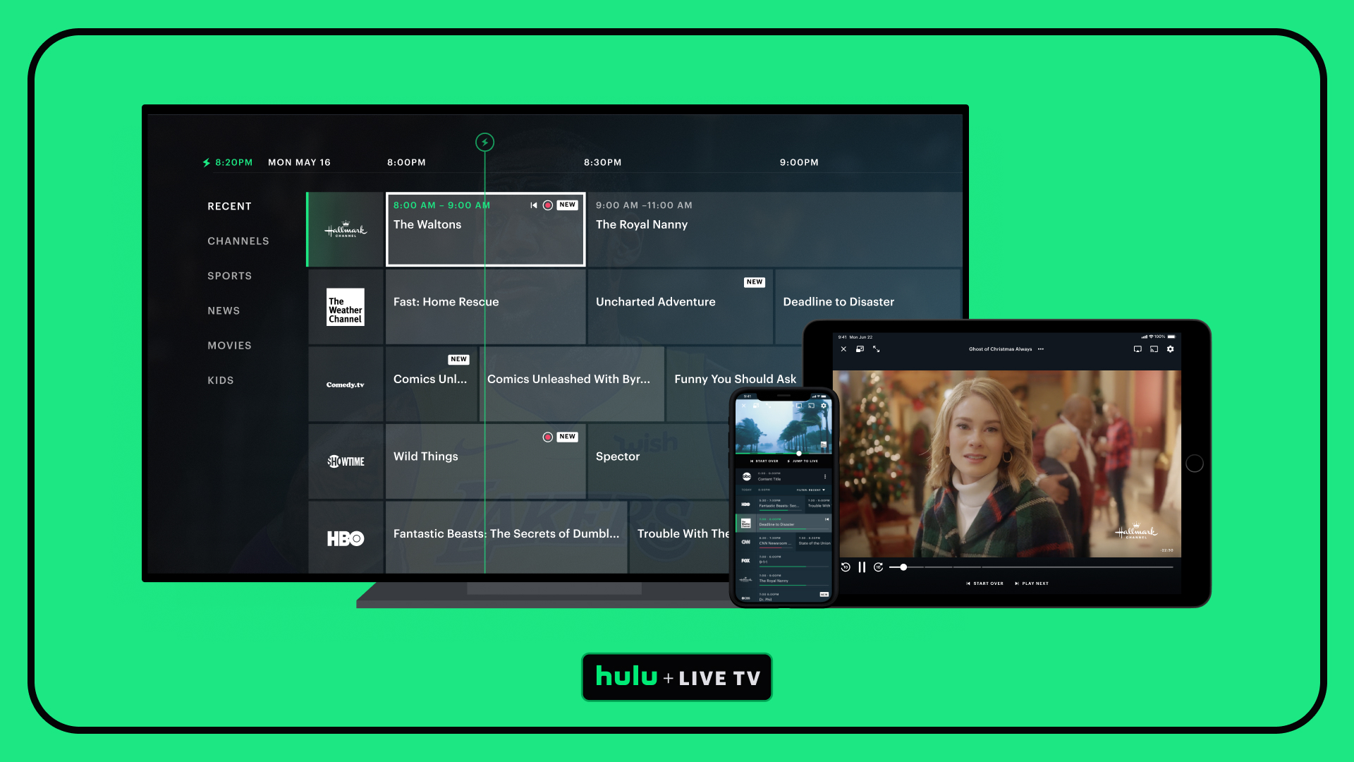
Today, we’re starting a third step in evolving live TV on Hulu. We know that many of you love the new UI, but we also know that many of you miss having a channel guide for Live TV. So, on the Web experience for live TV, we have enhanced the UI to make it easier to see what’s on now, what’s on next and change the channel while you watch and plan for your afternoon or night of TV.
With these changes you can:
Access during live playback from the guide icon in the lower left corner, or hover your cursor near the left side of the browser window
Scroll through all of your channels to see what’s on now, or click the arrow on the right to see what’s up next on any channel
Click on the channel logo or the program name to start watching that channel
Easily find and sort your favorite sports, news or kids programming by using the filter at the top of the guide


Today, the dynamic guide is available on the Web and we are eager to learn how you use it before we roll it out to additional platforms in the coming months. You’ll also see our content recommendations continue to evolve to more clearly help you keep up on the shows you watch every week, easily resume the show you’ve been bingeing on, and have more control over what content is recommended to you.
We hope you love the improvements we’ve made so far, and can’t wait to hear what you think of the guide. Thanks for all of your input over our first six months— and please keep it coming.


